Putting a Label on It:
Louisiana Contemporary at Ogden
The 15th iteration of Louisiana Contemporary is on view at Ogden. In a show of 50 works, painting is the dominant medium represented. Of the 20 figurative paintings in the show—there is one abstract acrylic on canvas—several depict realistically painted subjects in scenes that are uncanny or “surreal.” A campfire burns in a room where two women pose on a ladder (Kathryn Citrin, Sisters). An inexplicable crimson red stain overtakes the grass in a park (Pamela Skehan, Tipping Point). Lilies grow in a young girl’s hair (Brandon Felix, Blooming Lily Braids). A Magritte-like man wearing a suit and hat, back to the viewer, stands in an unfurnished space facing four strangely-dressed children (Alexander Stolin, Father Dear). It’s a lot of surreal for one room. I don’t know if that had to do with the juror’s taste or a regional tendency I haven’t noticed. These and many paintings throughout the show display a high level of rendering skill and storytelling, but few—I counted three—show virtuosity or exuberance about the actual paint or the act of painting. The surface of a painting is where this shows up and I wondered what (if any) effect selection by digital image had on the outcome of the show.
Photography is also ample, with 14 modest-sized photographs by 14 different artists. Sydney Walker’s The Way We Mask feels complete as a stand-alone artwork that goes beyond “the decisive moment.” The artist has created a surprisingly rich image within its small 14” x 16” dimensions. The vertically-formatted portrait is cropped a little closer than tradition dictates and the head in the photograph is a little larger than life-sized.
The information in the image seems to reach us slowly, one impression or revision at a time. At first I saw a balaclava, but this head covering is distinctly DIY. The subject’s head and face is wrapped in dark blue tulle fabric, an opening left just around his teeth—no, gold grillz. From the little bit visible at the sides of the mouth I see he is brown-skinned and bearded. In New Orleans, “mask” can be a verb and it’s used this way in the title, The Way We Mask. It’s a strong work, though a little hard to see because the frame glass is so reflective.
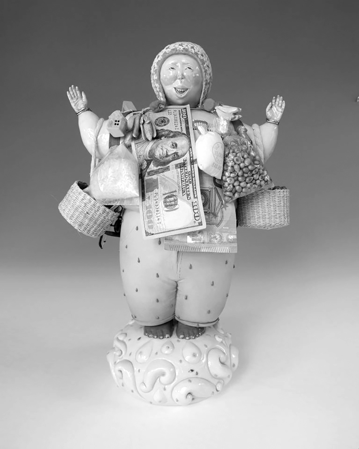
The stand-out in the show was Nathalia Toledo Barcia for her porcelain sculpture Ekeko in Custody. The sculpture is displayed on a free-standing pedestal under a vitrine which allows a 360º view. The figure, whose round face reminded me of a Botero painting, stands about 16 inches tall with its elbows out, hands up, laden with sculpted and found objects. This is Ekeko, a pre-Columbian Andean god who, according to the object label, oversees “abundance and prosperity, represents the dreams of those who ask for what they need and are willing to offer something in return.” The geography of the backstory meets the moment in the title of the work and the god figure’s gesture of surrender. This piece was awarded the Helis Foundation Award for Best in Show.
The bad news is, throughout the exhibition, the object labels are a hot mess. I can’t possibly be the only one who cringes at the large red ribbon graphic printed on labels indicating 1st, 2nd, 3rd Place winners, as well as Best in Show. To be clear, my objection is not about giving artists cash and praise. It’s the display that positions artworks like livestock at a state fair. What’s wrong with a little rustic flair? “This is LA not L.A.,” you might say. No, but it’s not middle school either. I take art seriously and the display of placement ribbons as well as the numeric hierarchy feels unserious. If organizers must put a ribbon on the recipient’s labels, I suggest a tiny red ribbon icon in the corner.
Standards in the way museums label art works help viewers easily understand who made what, how, and when. A casual art viewer may not ask, “What’s up with inconsistency in the way medium is listed for the photographs in this show?” But I will. Here is a sample of the gamut: “Fine art print,” “Gelatin silver print from 110 negative,” “Photography,” and so on. The standard is to note the photographic process used and the surface it’s printed on, especially if not typical, for example, “Chromogenic print on canvas.” In a perfect world, artists submit work labeled this way. In the second-best world, exhibition organizers circle back if this information is lacking.
A third grievance: Some include artist statements. Hold my coffee while I bang my head on the wall. Aside from my conviction that artist statements are a scourge in general, a museum wall label is absolutely not the place for one. I am A-OK with a little “didactic text” explaining things—preferably facts not feelings—but this labor is on the curators or museum staff to provide or leave out. Didactic labels may be informed by the artists—especially if key words like Ekeko in the artwork described above are not right there in the title—but an artist’s thoughts or feelings about their art is irrelevant to the viewer’s experience of it. And only some of the labels include these artist statements; this inconsistency feels sloppy.
Last grievance: The wall label next to one painting has placeholder text at the base of it. “Collection/Credit Line/Object ID.” This is not on the artist. Quick story: When I was young and careless, I submitted some poems to a magazine. I don’t remember what detail I got wrong, but the editor’s comment wasn’t about my work. My submission was denied with the words “A little attention would show some respect.” Ouch. But I’ve never forgotten it.
Louisiana Contemporary runs through February 14, 2027. For more info, check out ogdenmuseum.org/exhibition/louisiana-contemporary-2026.
Top photo: Nathalia Toledo Barcia, Ekeko in Custody, 2026, Hand built porcelain sculpture, glazes, underglazes, plastic, rubber, wood, metal, paper, currency, straw, cotton and strings. ogdenmuseum.org
